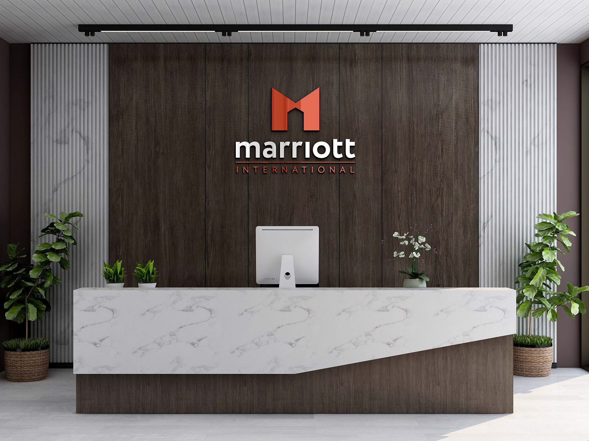
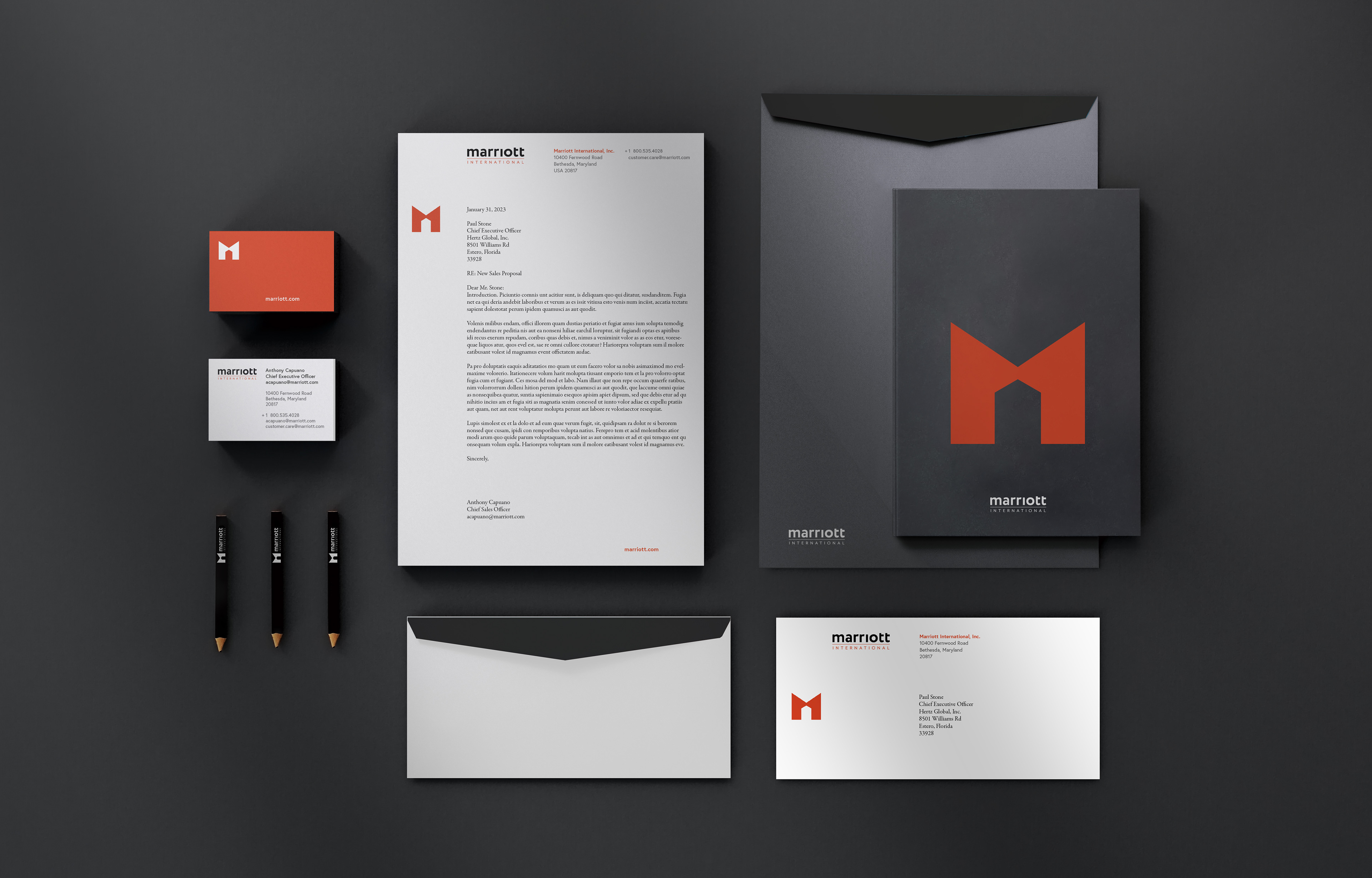
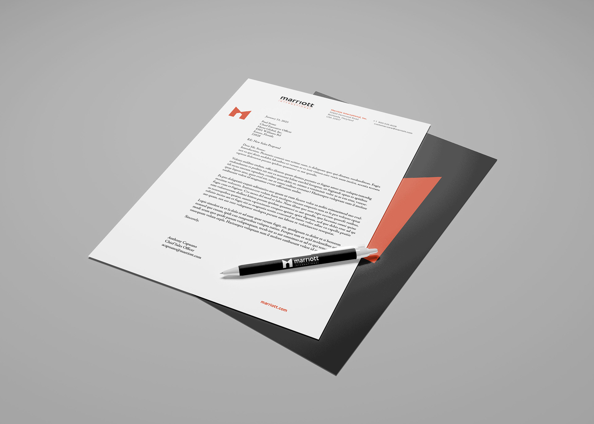
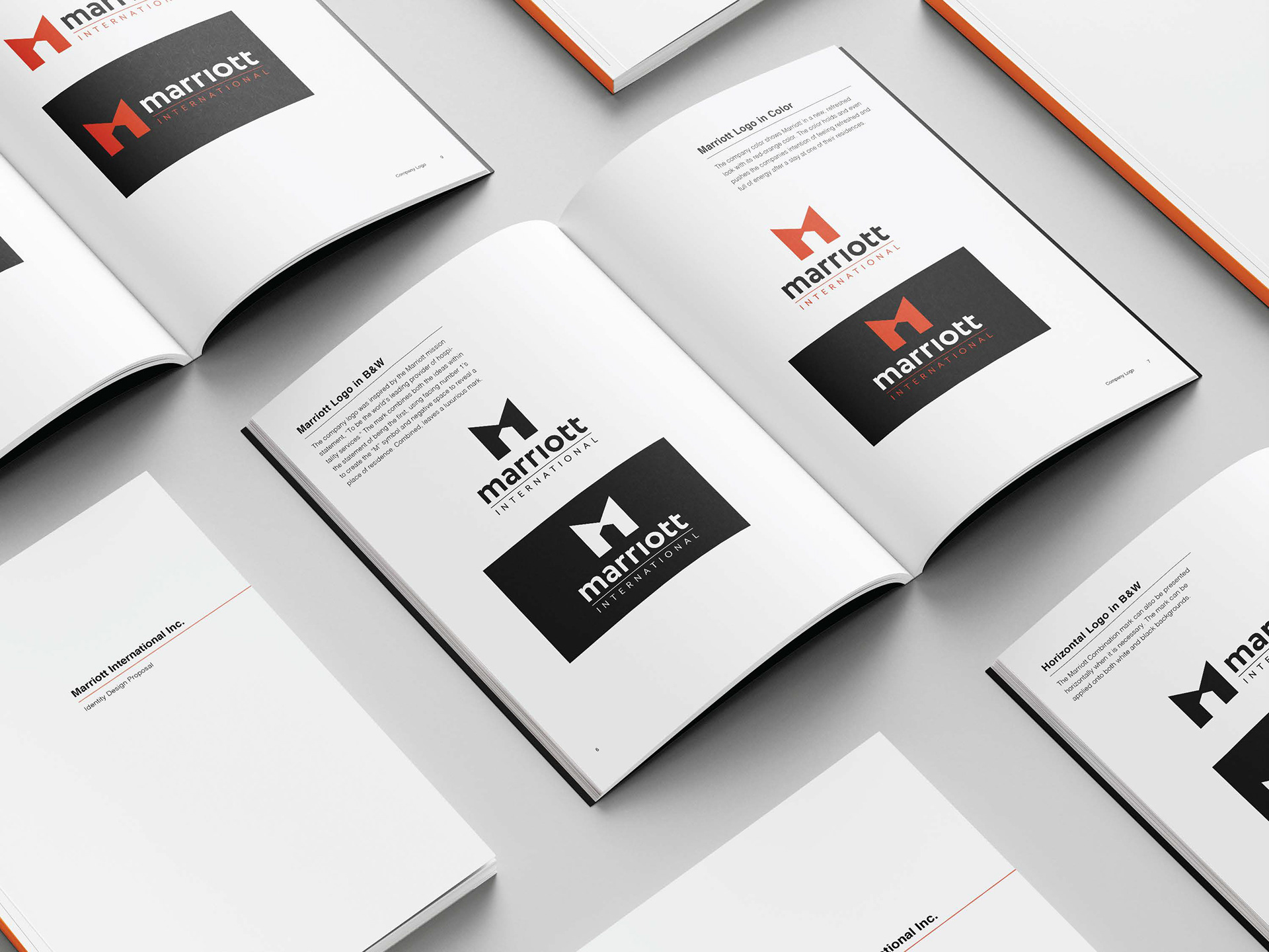
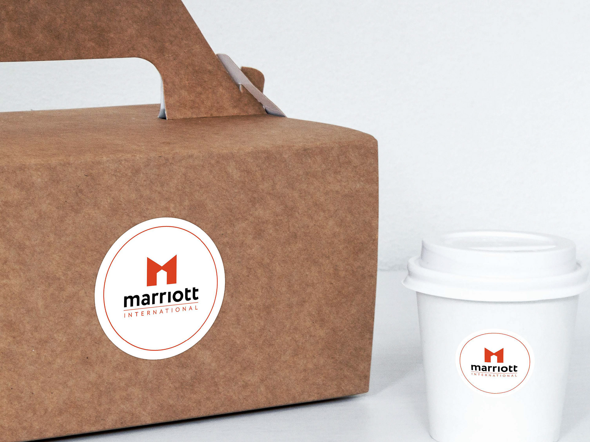
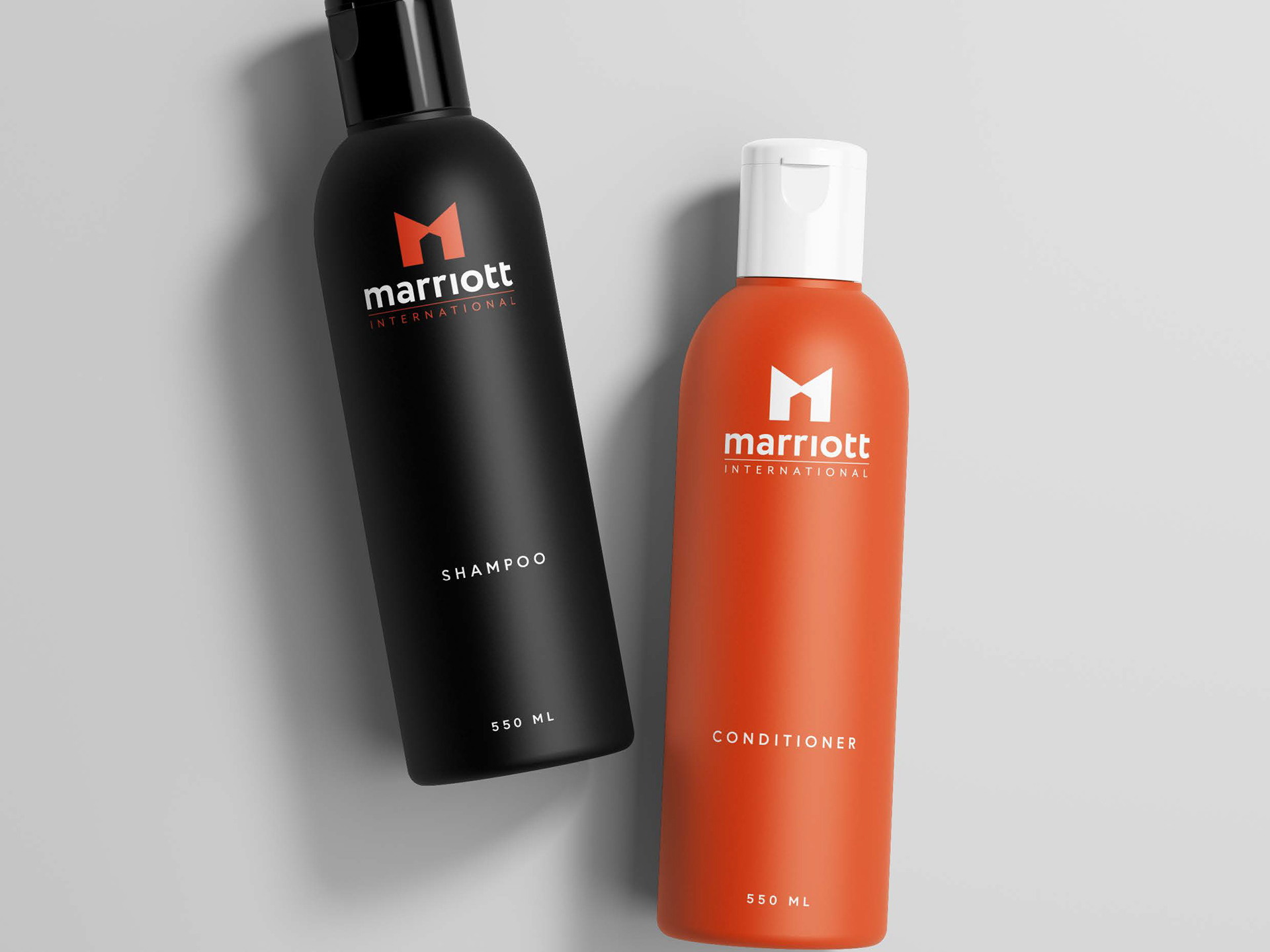
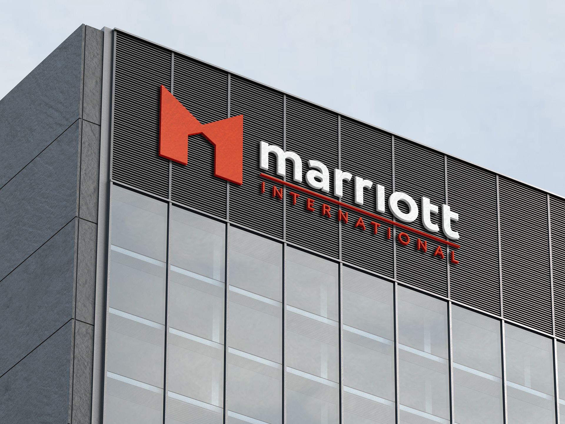
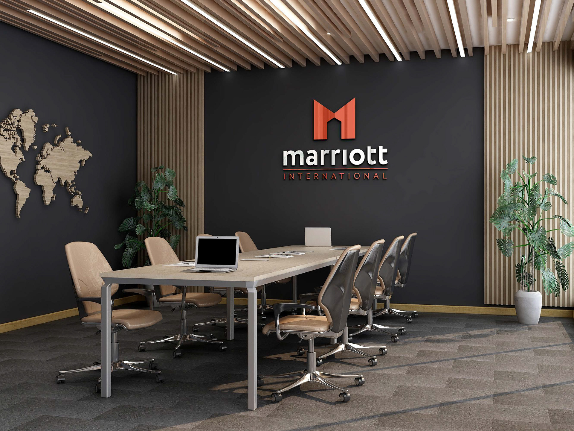
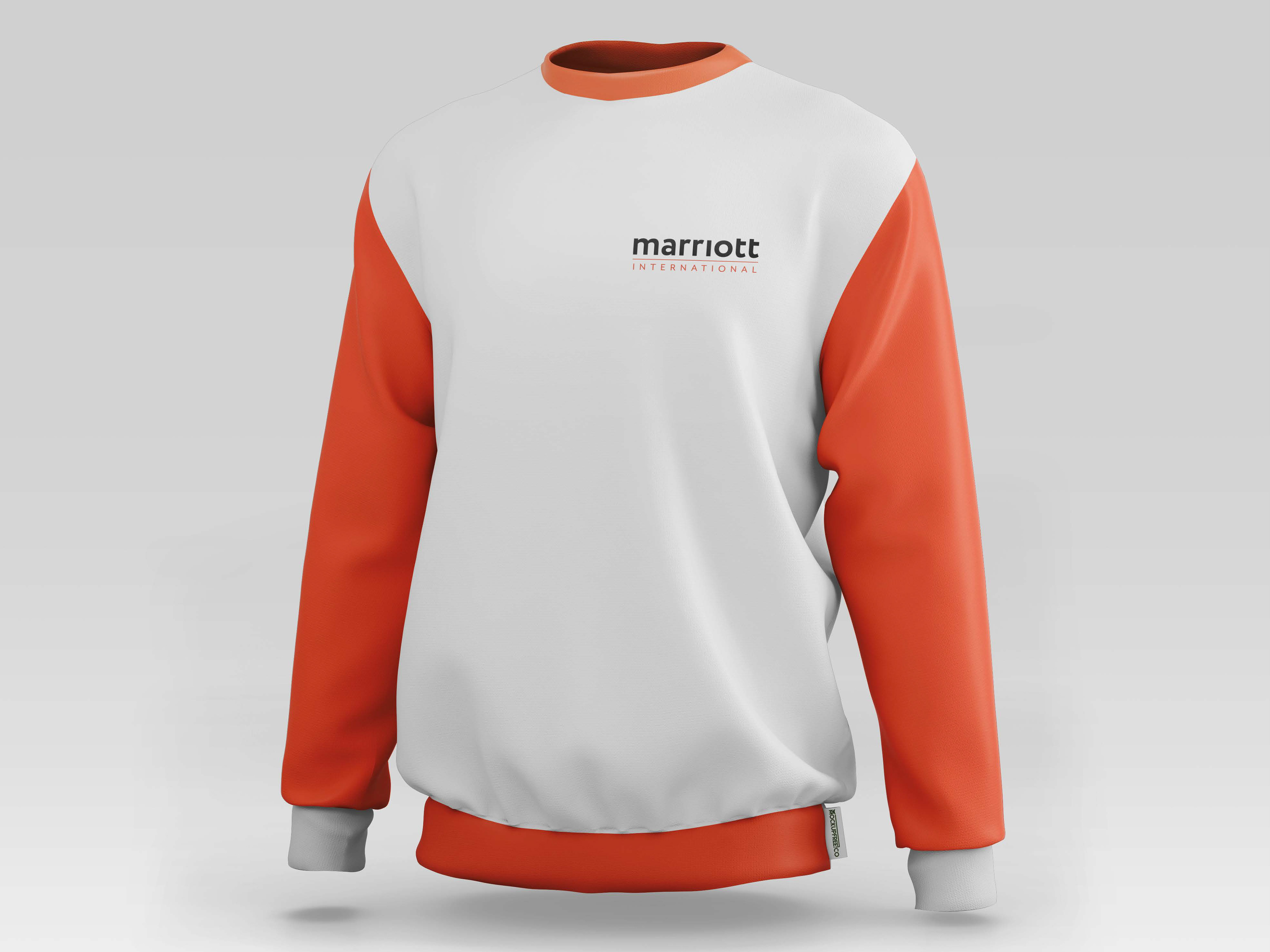
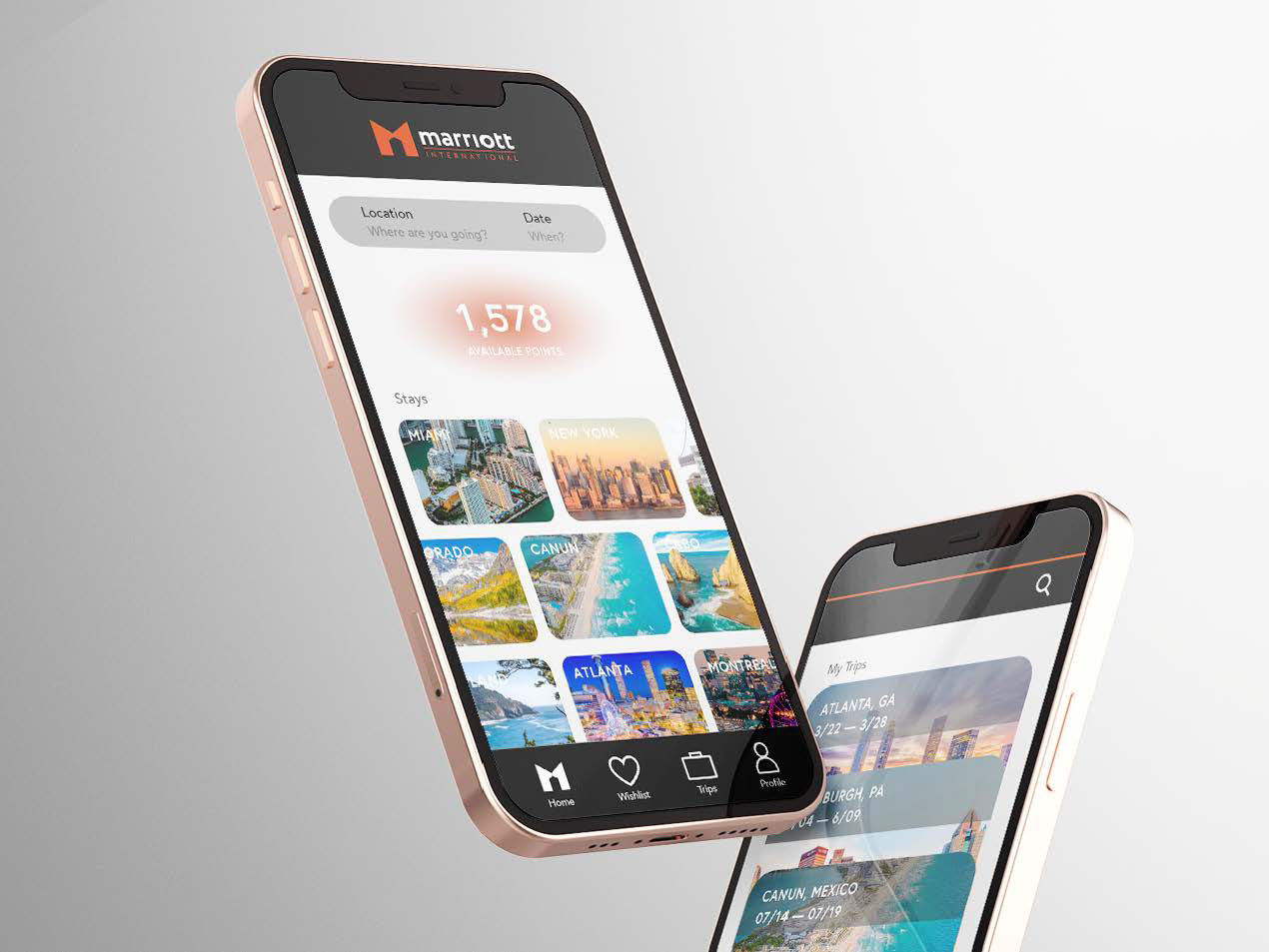
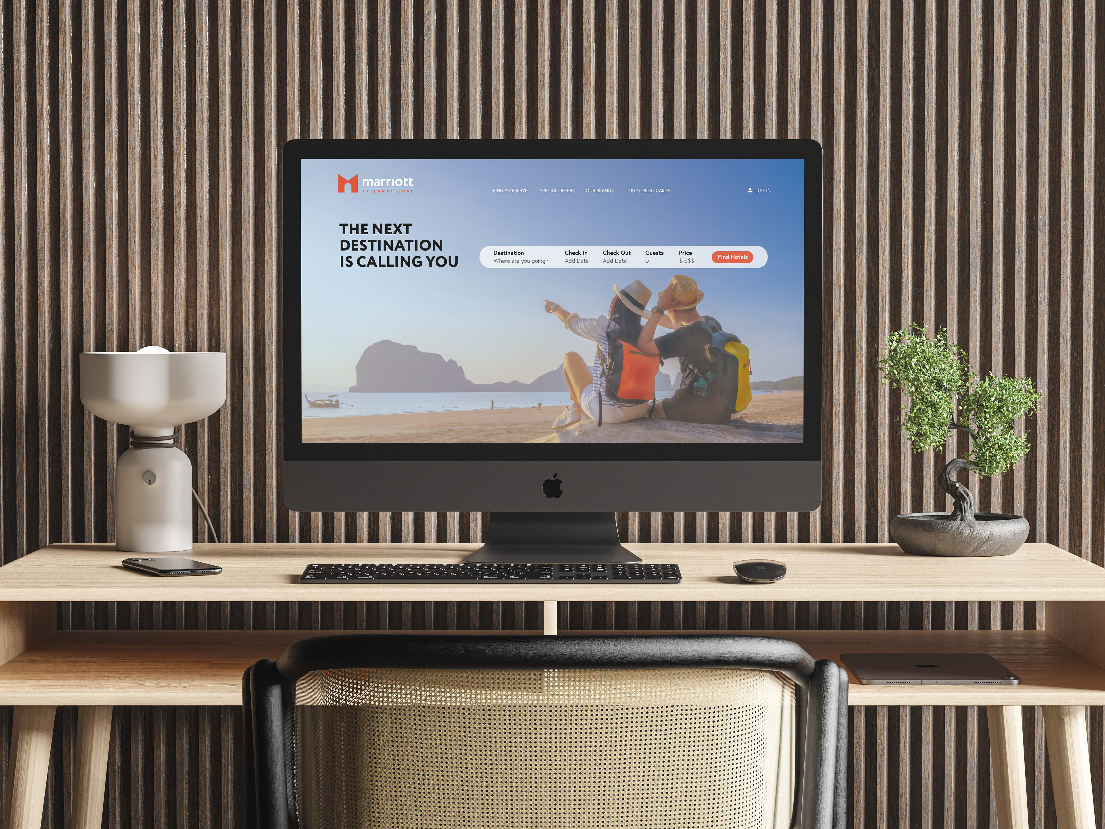
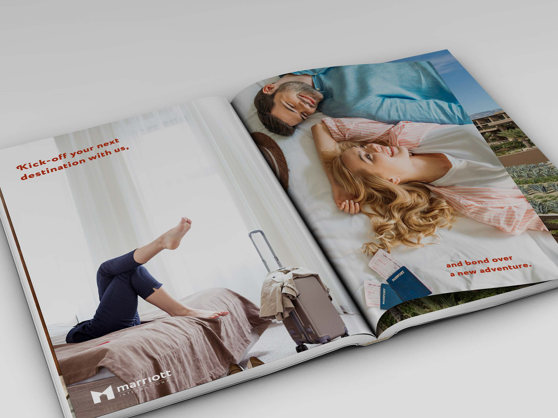
Marriott International, Inc. has established a reputation for consistency, reliability, and exceptional service since its founding in 1927. As part of a rebranding effort, I delved into the company's rich history to ensure the updated look and feel closely aligns with its core values. Inspired by Marriott International's mission "To Become the World's Favorite Travel Company," the logo mark creatively incorporates facing number 1’s to form the distinctive "M" symbol. Through the clever use of negative space, the design subtly evokes a sense of home, resulting in a logo that radiates luxury and innovation while reinforcing Marriott's leadership in the hospitality industry.
This project was developed as a final studio assignment at SCAD, created out of passion to help peruse a role at the company.